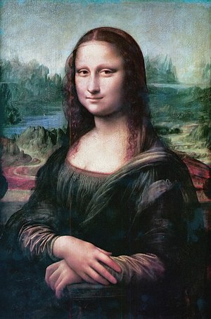
 Image via Wikipedia
The issue becomes more muddied when we add the critical word “content”. Design is supposed to be a mechanism to enhance content; to make access to the content easier for the user or reader. Design is not intended to be the end product, but rather the means to the end. Unfortunately, what has happened is we are living in a world where design trumps content.
A number of years ago I attended a design conference in San Francisco, where one of the speakers was the former art director of Ray Gun magazine David Carson. Ray Gun was a very hip magazine in the 90’s with a very avant-garde design. During his presentation Carson showed us progressive changes in his design of a particular story. The first was rather straightforward. This eventually moved on to a design where the type was printing vertically on the page, with over-lapping lines of text. In this form, it was virtually impossible to read the story. But he went one step further – he removed the entire story and used the headline only. A story with no story!
I asked a well-known design professor who also attended the event for his opinion. He quipped, “ How do you defend the indefensible?” Indeed.
In many cases, design has simply taken over content. This is particularly true with print and online publications. Probably the greatest loser in this takeover is photography. Print and online publications have created hip, attention-getting designs, which unfortunately force the content into the design, often life square pegs into round holes. Unusual shapes are invented for photos, which simply do not reflect the reality of the content.
The simplest examples are websites that have templates for one shape of image only. Try to imagine the Mona Lisa cropped into a horizontal image. This is what is happening in our new, heavily formatted, design inspired world. Designers are creating design that works for design, but unfortunately does not work for content.
The loser is the reader. With context removed, the reader is getting part of the story, part of the image and is short-changed. There is an aesthetic value that is also being lost as well and all of this appears to be acceptable to editors. Imagine a beautifully designed sports car that failed to deliver on performance, which drove only at slow speeds. This is virtually what is happening with over-designed publications. Design is being delivered intact. Content is not.


0 comments:
Post a Comment